


Do Colors Evoke Certain Emotions?
So Colorful and EMO!


As a child, many of us have been asked, what is your favorite color? Whether we realize it or not, color evokes our emotions after all.
In my latest blog post, Coastal Colonial Charm, I will delve into the impact that colors can have on your environment and the emotions that come with it. Drawing from my experience selecting colors for our new coastal colonial-style home, I will share insights into environmental psychology and color theory, along with tips for choosing your own colors.
The Designology book by Dr. Sally Augustin focuses on environmental psychology, which is based on scientific research on how the “design of the space we’re in has a direct and powerful influence on our mood.” When considering what colors are due to us and our emotions, it is important to think about them when choosing them. According to Dr. Augustin, people across the world are more likely to choose blue as their favorite color than any other shade. Bring on the blue!
There seems to be a neutral color palette trend in American homes lately, but I wanted to have a house that provided more color contrast. Neutral colors like white or beige are often chosen for walls to avoid choosing the wrong color or brown furniture that won’t show wear and tear, as explained in the Designology book.

Ladies and gentlemen, add a splash of color to your home with these helpful tips below so you will feel more confident in choosing what is best for you (and not just choosing white or brown colors).
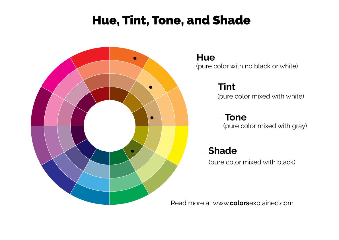
Choosing colors for our home can be overwhelming due to the vast number of color options available. Color theory is crucial to understanding the different concepts involved in selecting colors. I remember my interior design color class, where I struggled to paint different shades of color by adding white paint to each color square to change its brightness. It was quite challenging, but it helped me gain a valuable understanding of color theory.
According to the Designology book, to understand color, it is essential to know its three basic components - hue, saturation, and brightness. Hue is a “set of wavelengths we categorize into the same group,” and cultures assign different meanings to them. Saturation is “how pure a color is,” and brightness is “how much white seems to be mixed into a color” or lightness.
Colors can be categorized as warm or cool, and their temperature is crucial in creating the desired atmosphere for each space. When it came to choosing the color tone palette for my colonial-style home, I wanted a mixture of a warm and cool tone palette based on the rooms. The warm tones would give the home an energetic, inviting feel, and the cool tones would create a natural environment.
According to the painting company Benjamin Moore:
“Warm colors—yellow, orange, red and combinations therein—breathe energy, positivity and a sense of sunshine into any room. Cool colors—green, blue and purple—evoke relaxation and calm.
Neutrals like white and gray can also lean warmer or cooler depending on their undertones.”
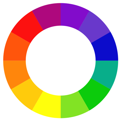
See the Benjamin Moore painting company graphic below to learn more about a warm versus cool palette.
Have you ever wondered what emotions a warm or cool color palette can evoke? According to Amy Morin, a Psychotherapist and international bestselling mental strength author, “Warm colors, such as orange, red and yellow can cause people to think the temperature in the room is warmer than it actually is. Cool colors, such as blue, green and light purple cause people to estimate the temperature is colder.”
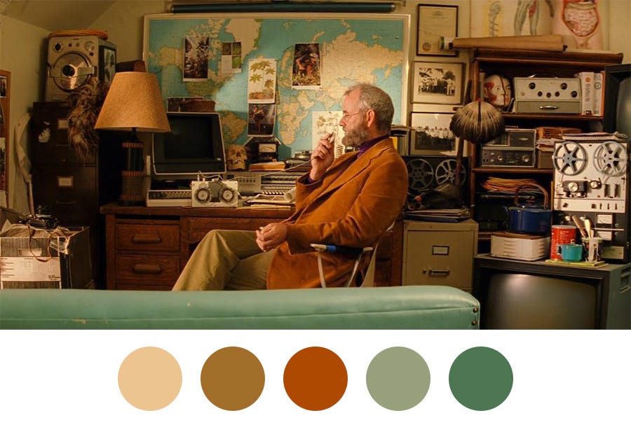
Are warm-toned color palettes used in Wes Anderson's films coming up, anyone?
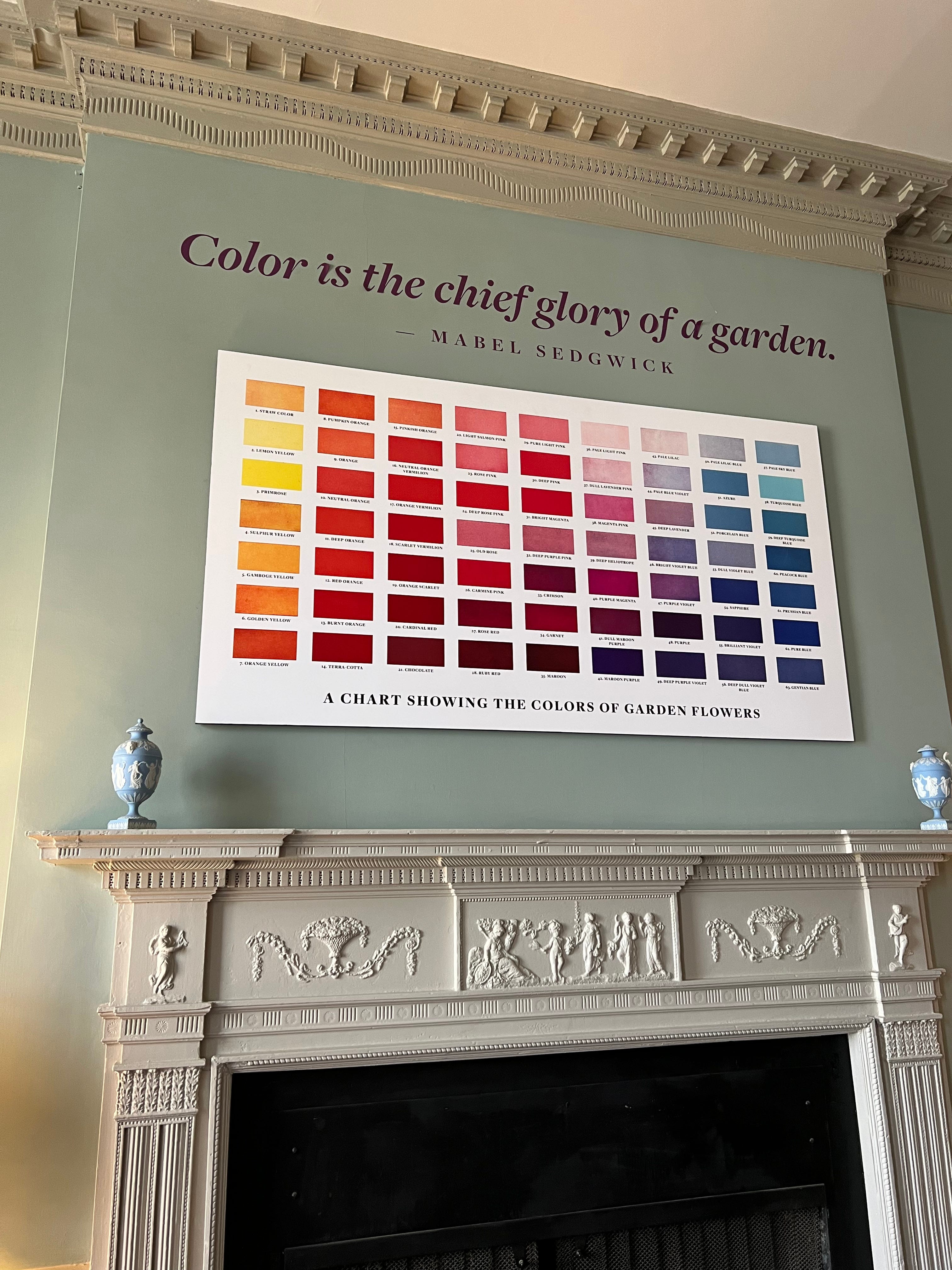
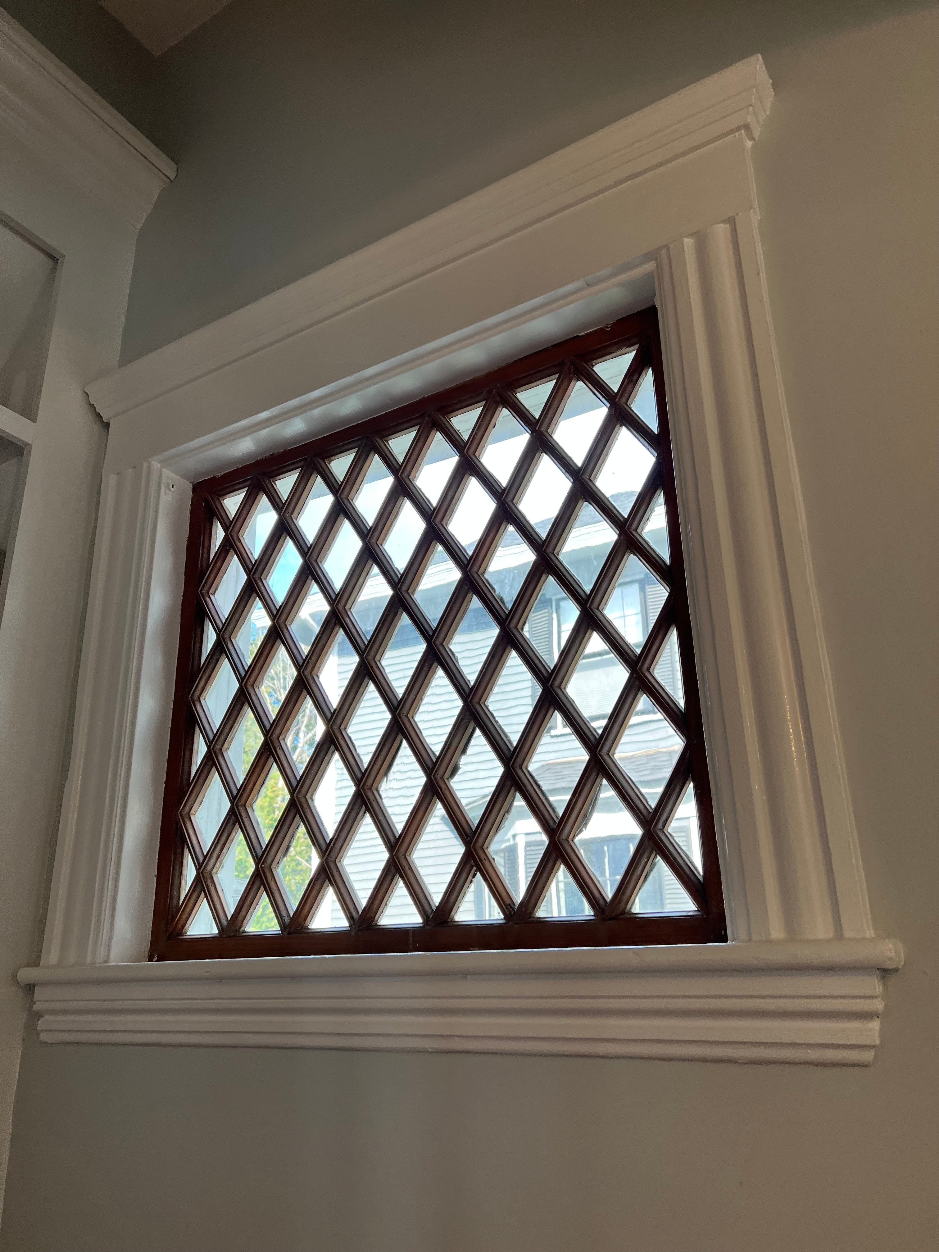
Consider each space's details and features when choosing colors to reflect your emotions. The color of a room can change depending on the lighting or lack thereof. It can also be affected by the size of the room, the presence of windows, the reflection of the floor, and the moldings in the room. We are fortunate to have the charm of historic crown moldings in our home that cannot be found in stores anymore. Our carpenter recently expressed his admiration for our crown moldings and mentioned that in order to replicate this molding style, it would have to be handcrafted. To create a cohesive and bright space, we opted for all-white moldings. We adore the look of crown moldings and hope to add more to our home.
As I mentioned in my previous blog post, I have had the opportunity to live in a few different countries like the UK, which has given me a deep appreciation for a design style that draws inspiration from various cultures around the world. I enjoy incorporating certain aspects of my travels into my home decor, which is why my home has an eclectic vibe that is influenced by cultural elements from different parts of the globe.
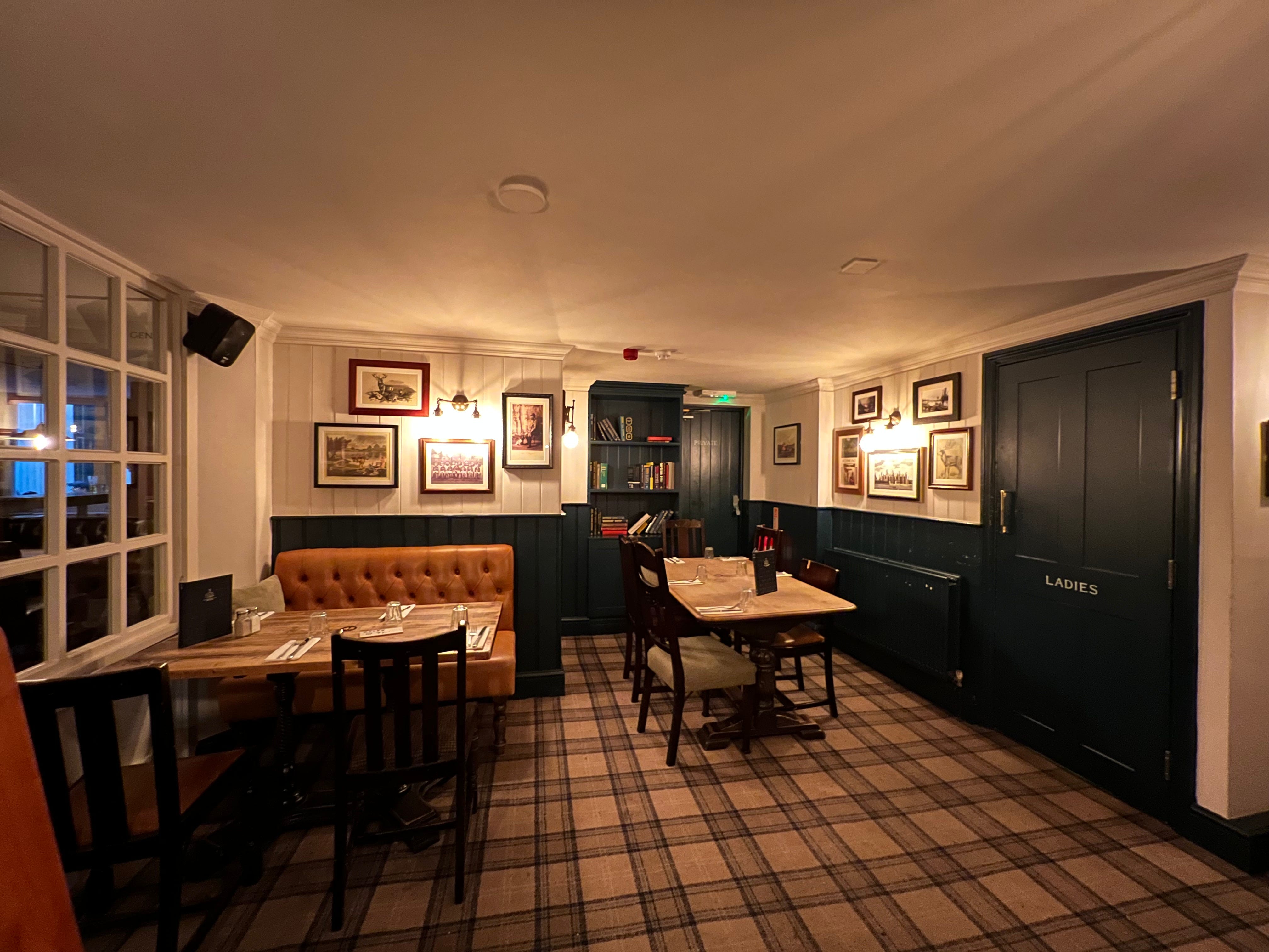
Luckily, during my recent trip back to London, I found a wealth of color inspiration in the city's cozy pubs with their wood-paneled walls, fireplaces, and well-worn furniture. British pubs create a pleasant color-memory link for me! Do you have any positive memories of colors from certain places that you can incorporate into your home?
One of my favorite paint companies is the British company called Farrow and Ball. During my visit to London, I checked out the Design Centre London and then went to the Farrow and Ball store in Chelsea. Beforehand, I had chosen my color samples based on the color psychology, the history of the color, and its recommended usage in various rooms. With these stories in mind, I picked colors for each room, and a color consultant helped me narrow down a couple of options.


For example, I loved the history of the Farrow and Ball Sulking Room Pink color for it was “evocative of the colors so often used in boudoirs, a room named after the French "bouder" - to sulk.”
During my time in London, I found inspiration in the interior spaces and the exterior surroundings. While wandering through the city streets, I came across some brightly colored blue-green front doors that caught my eye. I decided to snap some pictures of them as a reference for the kind of door I would like for my new home.


The Farrow and Ball color that caught my eye is bright and welcoming, and I find it more appealing than the neutral and dark colors the sellers previously had.


I was particularly interested in painting the kitchen because it was just plain white cabinets. As you can see from these before and after photos, I chose the moody Farrow and Ball Inchrya Blue color inspired by the “dramatic Scottish skies” that truly capture the essence of the place. Who doesn't feel a little moody after a long day of work and having to cook?


For example, when choosing which color is best, my husband's favorite color is blue, and mine is green. Our favorite room is the Farrow and Ball Green Blue color, which matches both our favorites. When picking out your color, ask yourself what is your favorite color. It is so interesting because we have a variety of colorful rooms in the house, and people seem to have one that stands out to them. They light up when they see it and say, oh, I love this color in this room.
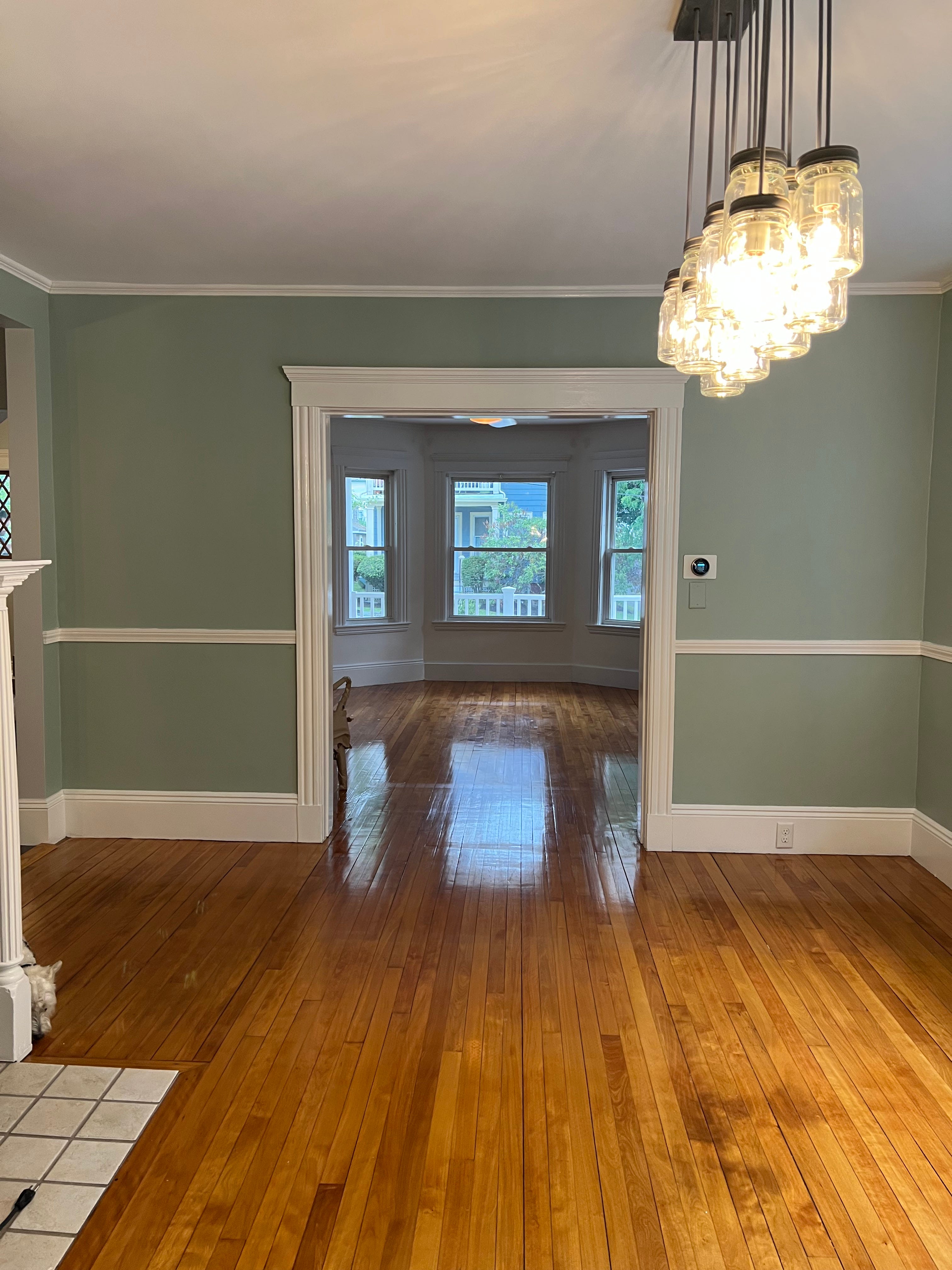
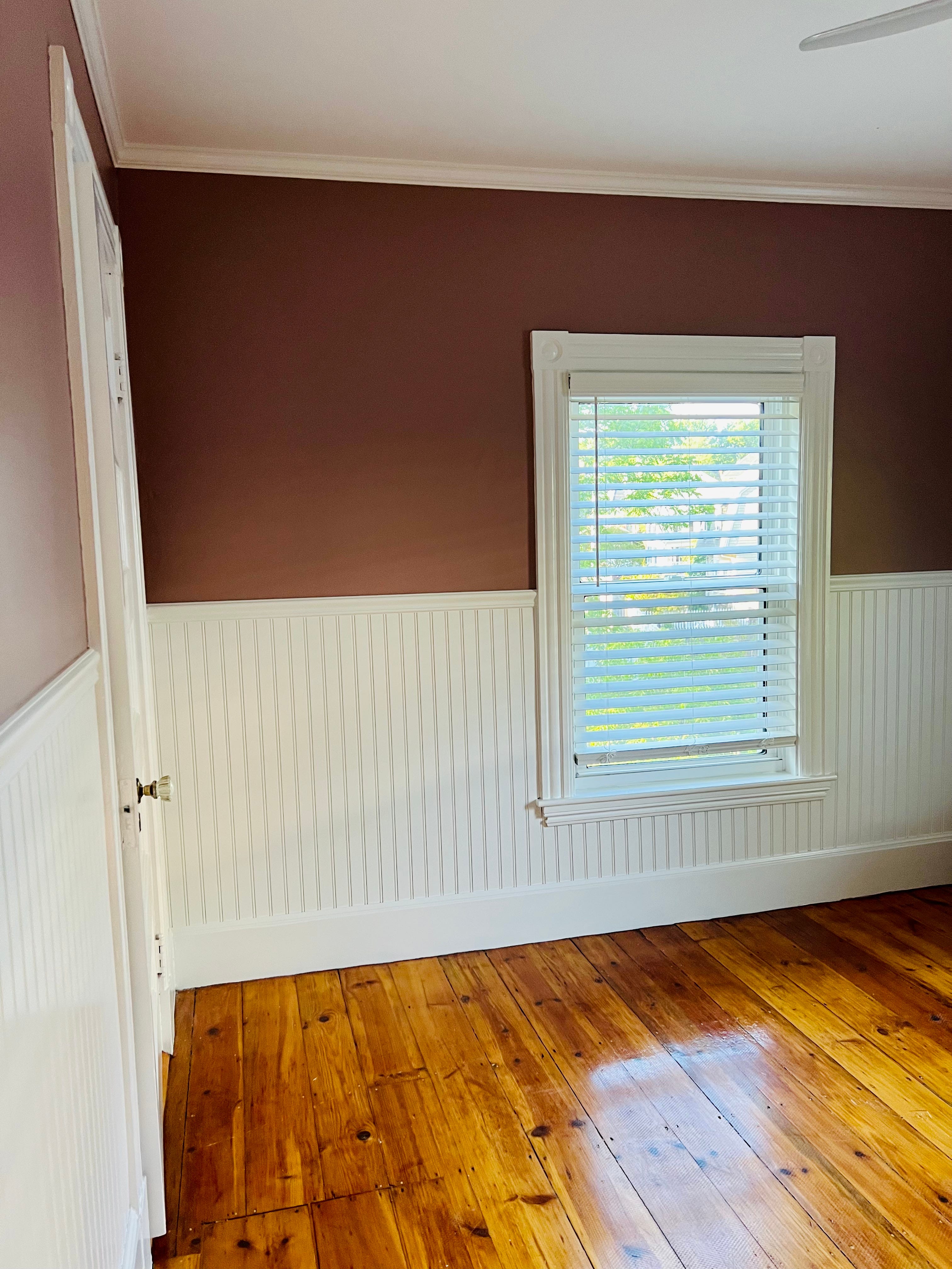
For example, do you want blue for a peaceful environment? I chose the first-floor color palette to be a cool-toned, coastal, serene one to go with the seaside town vibe. It is quite an open concept for a historic home, so the colors flow together well. The second floor has more of a warm-tone palette to make it more inviting, passionate, and cozy for the bedrooms and office space where the magic happens (as in this blog).
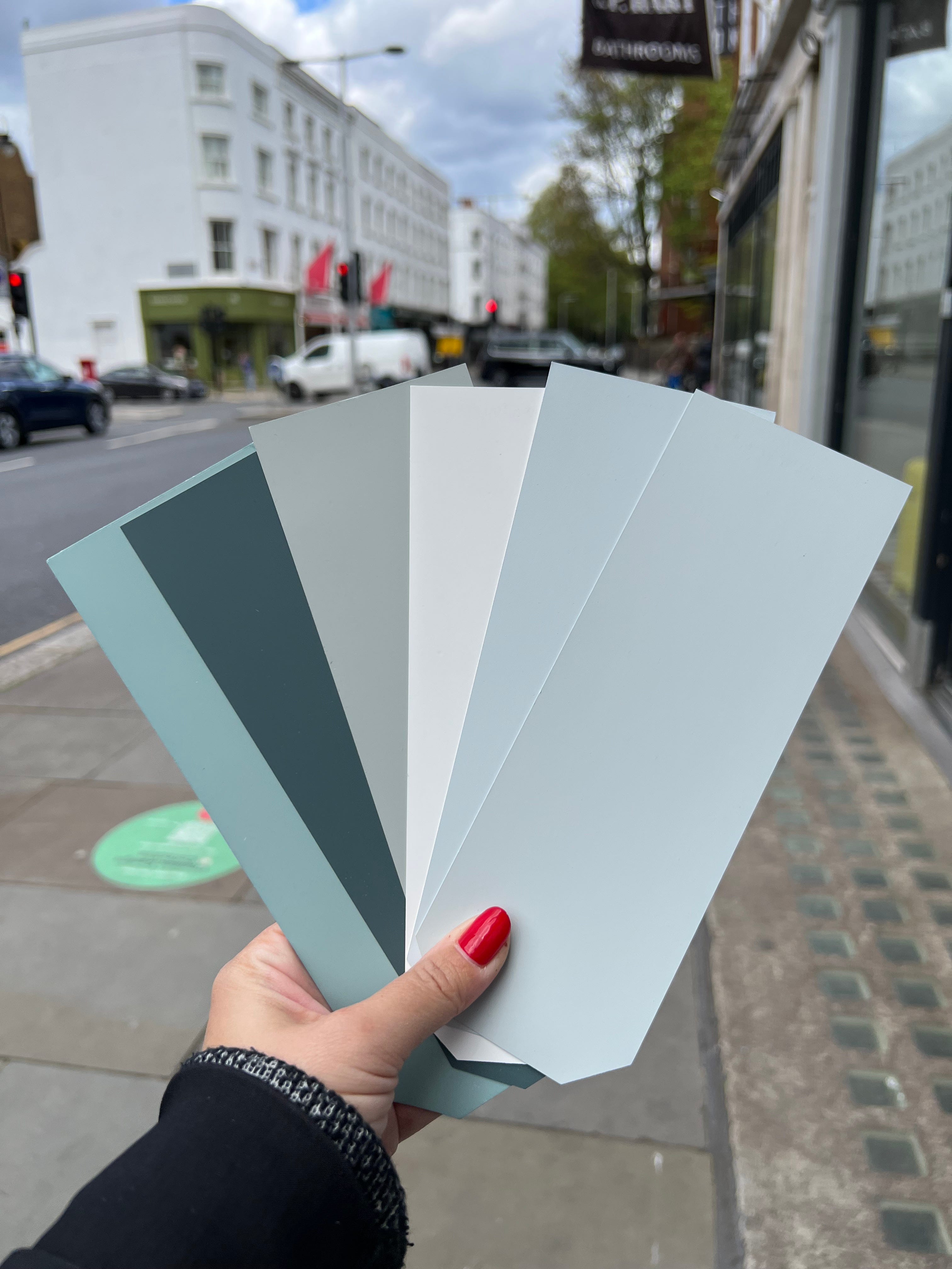
Below is a list of all the colors from Farrow and Ball that I picked in the home thus far. Hopefully, it will help provide some inspiration for colors in your home.
Front and side doors: Dix Blue
Kitchen:
Lower cabinets, door, and island: Inchrya Blue
Upper cabinets: Light Blue
Walls: Borrowed Light
Hallways and Foyer: Borrowed Light
Living Room: Green Blue
Office: Preference Red
Laundry Room and Closet: Sulking Room Pink
Second-floor Bedrooms:
Main: Selvedge
Guest: Whirlybird
Third-floor Guest Room: Stiffkey Blue
As you reflect on what colors you want for your home to evoke certain emotions. What is your favorite color, and what room would you paint it in? Please comment below.
Please subscribe below to follow along with my new homeownership journey for inspiration on how to make a beautiful, harmonious home and garden. Join the Coastal Colonial Charm community on Instagram for even more captivating content!